The market has dumped a bucket of cold water on investors during the past week. I’m going to get into some stocks I see that are resisting the decline and some suggested guidelines regarding certain stock chart patterns going forward.
But first, I wanted to address a common question I got on Monday: Was there any way to see the decline coming? Mostly, the answer to that is no—if it was possible to regularly predict most short-term market moves, I would be on a beach right now.
That said, the ugly action starting last week wasn’t a total shock. The main reason is that two weeks ago I started to see a ton of complacency from some market-based investor sentiment measures as well as some anecdotal evidence (such as a ton of recent IPOs rising 100% to 200% in one month).
[text_ad]
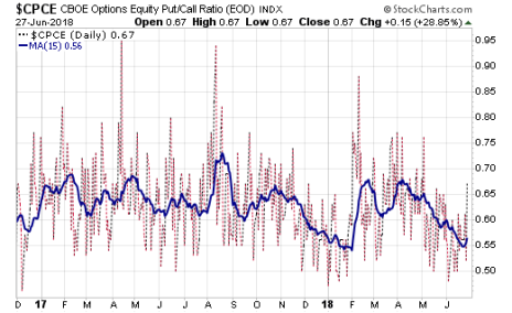
For example, one measure I watch is the equity put-call ratio from the Chicago Board Options Exchange (CBOE). The day-to-day readings aren’t very meaningful, but if you plot a 15-day moving average, it can often point out times when big investors are buying protection (high put-call ratio) or are complacent (low ratio). You can see from the below chart that the put-call ratio reached super-low levels in January (near the market top) and again the past couple of weeks.
Another sign that the advance was getting ripe: The number of stocks hitting new highs on the Nasdaq stretched to 336 on June 6, which was the highest since January and one of a handful of highest readings during the past year. Such readings tend to be positive signs longer term (it’s a bull market!) but often lead to some short-term selling (“overbought”).
Now, to be clear, investor sentiment measures are very inexact (they can be weeks early or late). In fact, extreme readings can actually coincide with a “kickoff” of a new uptrend (though that’s usually coming out of a major market decline or basing area, like in November 2016).
But these various investor sentiment readings can give you an indication when most investors are leaning heavily (possibly too heavily) the wrong way. I won’t pretend I was a hero and sold a bunch of stocks based on these measures (I didn’t), but I did advise subscribers to take it easy.
In Cabot Top Ten Trader’s June 15 update, I wrote “It’s important to keep your feet on the ground. Many stocks are hugely extended to the upside, and there’s growing evidence that investor sentiment is getting giddy (a negative). Thus, we wouldn’t be surprised to see some sharp pullbacks either in the market as a whole, or possibly shakeouts in the hottest areas while money rotates into beaten-down areas. With profits having come quickly, it’s good to remember (a) to take a few partial profits if you’ve been handed a great gain in just a couple of weeks, and (b) to look for solid entry points on the buy side (as opposed to just chasing something up the chart).”
Four Stock Chart Patterns to Watch
Stock Chart Pattern #1: ServiceNow (NOW)
Moving on to individual stocks, I wanted to run through a few different types of charts and tell you how I see them following the recent advance and pullback.
The first chart is one that’s not bad from a longer-term perspective, but is showing enough of a change in character that it’s not on my Watch List.
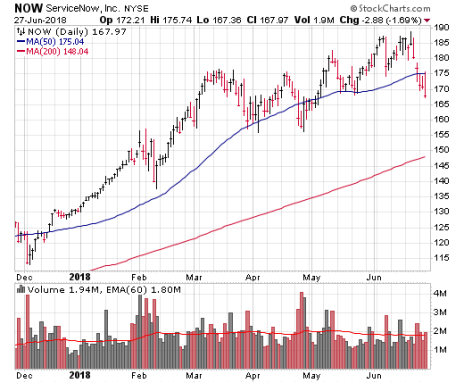
ServiceNow (NOW) is a great company, but notice (below) how the chart contains some flaws—after a stunning run to its early-March high, shares have tried to get going a handful of times since then, but each attempt was quickly met with selling. Said another way, the sellers have been willing to take profits every time NOW pops higher. I’m not saying this is long-term abnormal action—NOW remains in a major uptrend—but that action knocks it down my Watch List for new buying.
Stock Chart Pattern #2: iQIYI (IQ)
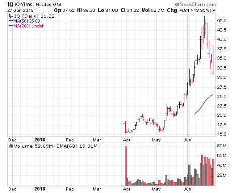
The next example is a stock that’s had a huge run and has now pulled back sharply. iQIYI (IQ) was one of the hottest of the hot Chinese IPOs from mid-May through mid-June, rallying from its breakout level around 20 to a high of 46 in just a month! The pullback since then has been sharp (33% or so) and contained six big-volume selling days.
After such a huge run, the drop in iQIYI stock is certainly a red flag for the near term. That said, the severity of the decline looks reasonable given the prior run—the stock almost certainly needs some time to build a new launching pad, but I can’t definitively say the stock has topped for the next few months.
In fact, on a broader point, I would guess the next few weeks (months?) will separate the wheat from the chaff for these recently-hot IPOs. Right now, IQ is worth watching, but there’s no lower-risk entry point on the chart.
“OK Mike, but what about potentially buyable setups?” you might ask. Right now, I see two types of stock chart patterns.
Stock Chart Pattern #3: Supernus Pharmaceuticals (SUPN)
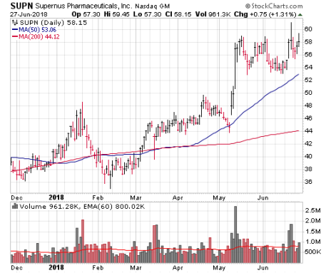
The first is one that’s shown some strength but is still within a basing area and could get going if the market powers ahead. Supernus Pharmaceuticals (SUPN) is a good example of this pattern. Shares of SUPN staged a huge breakout in May, but then went sideways in a tight range for a few weeks. The stock tried to hit new highs last week, but the market yanked it back in. From here, a move back above 59 to 60 or so would be highly encouraging if the market stabilizes; it’s worth watching.
Stock Chart Pattern #4: Spotify (SPOT)
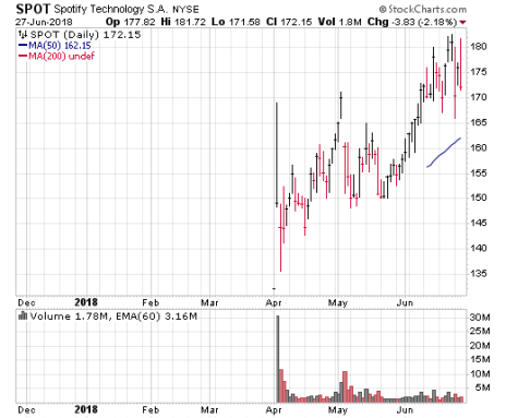
The second type of pattern I’m looking at is your traditional shakeout, where a stock has shown some sort of upside, hitting new highs and flashing some unique signs of accumulation, only to have a short, sharp shakeout (followed by a rebound). Spotify (SPOT) is a solid example of this—not only did shares pop out of an IPO base in early June and continue higher afterwards, but it flashed a ton of up days during its rally (including 15 of 17). Given that this recent IPO trades north of $300 million per day in volume, that string of up days is a sign big investors were active.
And then, after hitting 182, SPOT has been yanked around, but is still relatively near its peak, a sign that it wants to go higher should the market right itself.
The bottom line is that, when the market gets rocky, it’s vital to know the difference between normal weakness and abnormal selling, and to be able to identify which charts of fundamentally-attractive companies are good buys.
And that’s the basis of my Cabot Top Ten Trader investment advisory, which uses a proprietary screening method to ferret out the strongest stocks in the market—identifying where the big money is flowing—and find low-risk buy ranges and follow-up advice as the trades work.
To learn more about Cabot Top Ten Trader, click here.
[author_ad]
