I haven’t written a Cabot Wealth Daily column in a while, and with lots going on in the market during the past few weeks, I figured now would be a good time to just go through a bunch of things I’m seeing and what to make of them—along with a healthy batch of long-term stock charts and some stock ideas, too. Let’s dive right into it:
10 Long-Term Stock Charts - and What They Mean
1. It’s not 1999 out there, but the action among growth stocks has been impressive. Yes, we have earnings season coming up, and yes, I’m still seeing a good number of potholes and so-so action (more on that in a second), but as I wrote in last week’s Cabot Growth Investor issue, I’m seeing a lot more power and persistency out there, which are breadcrumbs suggesting that institutional investors are active.
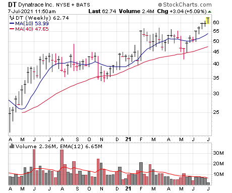
Take a look at the weekly chart of Dynatrace (DT), which is a name I have on my watch list. Ever since last summer, shares haven’t had more than three weeks up in a row, and for the most part the stock’s action resembled a kids scribbling on a piece of paper. But look at the action since mid-May: DT is working on its seventh up week out of eight, and the one down week featured low volume and tight trading (narrow range from high to low). No guarantees, of course, but it certainly looks like a change of character, and I’m seeing a lot of this sort of thing out there.
[text_ad]
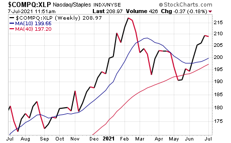
2. It’s the same sort of thing when looking at some of my favorite secondary indicators. One of them (again, written about last week in Cabot Growth Investor) is my own Aggression Index, which simply plots the relative performance line of the Nasdaq with the consumer staples fund (XLP). It’s not hitting new highs, but it found support near the key 40-week line and has obviously bounced nicely since. It’s not the be-all, end-all, but again, it looks like a change in character after three tough months.
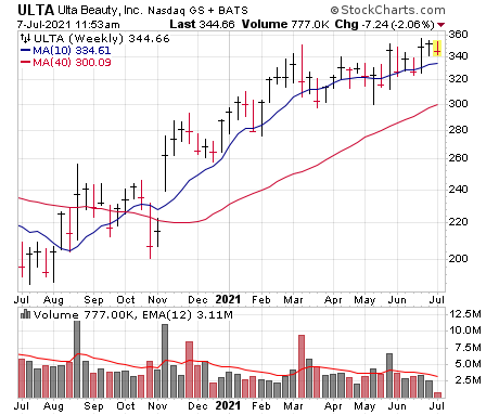
3. “But Mike, I haven’t bought much yet in growth land—isn’t it too late after a strong few up weeks?” Well, I do think the market environment is still rotational, so you want to pick your stocks and buy points carefully. But no, I don’t think it’s too late; in fact, I still think most stocks are in the “setting up phase.” Take a gander at Ulta Beauty (ULTA), for instance—it’s not quite the young growth stock it used to be, but the setup is great, with shares tightening up just south of new highs (part of a huge two-year base) following a bullish earnings reaction a few weeks back.
Plus, the good thing about seeing power and persistency is that usually (not always!) the first pullback, shakeout or brief rest period (couple of weeks-ish) offers a good entry point. (This is my one of my favorite entry patterns, in fact, which I simply call Early Stage Pullbacks—or ESP for short.) Thus, Nvidia (NVDA), which is probably the leading big-cap name of this nascent upmove, “should” provide an entry point when it finally retreats into some moving averages.
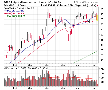
4. So what’s not to like? Well, even among growth stocks, there’s still plenty of wobbles and Jell-O-on-a-plate type of action, especially at key levels. Applied Materials (AMAT) is a good example—it broke out of a multi-year base last November and enjoyed a great run, and now it’s consolidated for 14 weeks in a reasonable range. But, so far, the stock keeps being rejected in the 140-145 area. That’s more descriptive than predictive—maybe the stock breaks out in the days ahead—but the point is there’s a lot of this thing out there, with stocks looking good but not quite able to let loose on the upside, at least not yet, even as the Nasdaq has been heading straight higher of late.
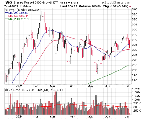
5. Moreover, given how split the market has been during the past couple of years (growth does well when value suffers, and vice versa), I’ve been putting more weight on growth-heavy funds and indexes. And those look … better, but not amazing. Take a look at the Russell 2000 Growth Fund (IWO), which has perked up, but couldn’t get past resistance in the 315 area before backing off this week.
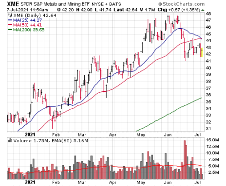
6. Outside of growth, I’m far less sanguine, at least for the moment—to me, cyclical stocks (and the broad market as a whole) are looking iffy after big runs, with industrials, metals, financials and transports all looking ragged. The SPDR Metals and Mining Fund (XME) is a good example, with a big run, a decisive breakdown and no real bounce since.
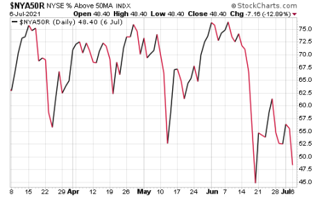
7. Playing into that is the fact that breadth has suddenly become an issue. Shown here is the percent of NYSE stocks above their 50-day lines—with the S&P 500 hitting new highs last week, you’d think this figure would be in the 70% to 80% range, but no, it’s actually less than 50%! It’s the same story on the Nasdaq, despite that index ratcheting higher of late. Thus, in the intermediate term, the broad market remains a source of concern.
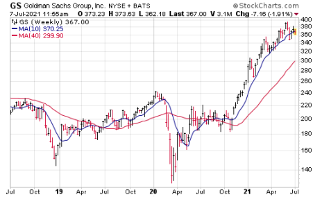
8. Note, though, that “intermediate term” really only means the next few weeks to couple of months—longer term, so many of these areas just came out of multi-year consolidations last November that I’d be surprised if they just up and died. For instance, look at this long-term stock chart of Goldman Sachs (GS), which of course is one of the granddaddies of the brokerage area: The stock went nowhere for more than 10 years (!), broke out in November and had a big run before some recent wobbles. It likely needs time to digest its gains, but big picture, the odds certainly favor GS moving higher.
9. When you put it all together, I’m growing more optimistic, but am still going slow—the action in growth stocks is certainly most important to me, but no matter how you slice it, it’s obvious that not every investor is rowing in the same direction. And when that’s the case, good-looking stocks can often go bad in a hurry. Thus, I’m generally buying small positions and picking my spots.
2 Long-Term Stock Charts that I Like
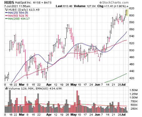
10. How about some stock ideas? I’ll give you two, the first of which I favor entering on dips. It’s HubSpot (HUBS), which has become a go-to provider of marketing solutions (and more) to small- and mid-sized businesses that are all of a sudden doing a ton more business online. Sales growth is accelerating, earnings projections are strong and the stock looks great. Dips of a few percent (maybe into the 570 area?) would be tempting.
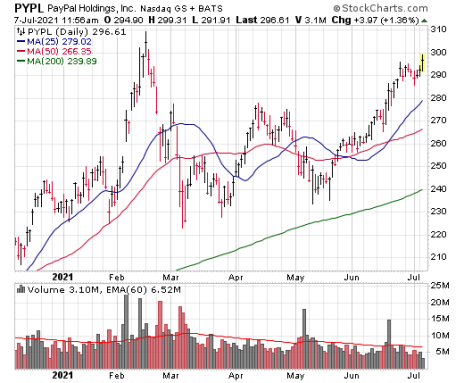
Then there’s PayPal (PYPL), a great long-term growth stock that is back near the top of a five-month consolidation. I like the big-volume support on earnings in early May, and then another round of big-volume buying last month when the firm upped its sellers fees.
Ideally, PYPL will chill out for a bit, with earnings (due July 28) a possible catalyst.
[author_ad]
