After a great, relatively smooth 2017, this year has been a wake-up call for investors. What started out with a moonshot in January gave way to a mini-crash in early February. But the feeling during that brief plunge, which came with no obvious reasons for the decline (after a few days we heard some short-volatility products may have exacerbated the decline), didn’t elicit much worry, as the market began bouncing back in short order.
Today, though, the feeling is different. Not only has the market seen a failed rally, but the major indexes are revisiting their February lows (10% off their all-time highs in January, give or take) and many high-profile names like Netflix (NFLX) and Amazon (AMZN) have been cut off at the knees. Moreover, the headlines have turned very inauspicious, with every day bringing news on tariffs (and a potential trade war with China and others), Fed rate hikes and more.
Combine that with a huge run in recent years, and a question has crept into investors’ minds: Have we started a new bear market?
[text_ad]
Before I share my thoughts, let me first say: I am a trend follower, and right now, the intermediate-term trend is down. Thus, I’m advising caution in my advisories, including little new buying and holding plenty of cash. In other words, I’m not whistling past the graveyard.
That said, if we’re talking about a major downmove that lasts more than a year and takes down leading stocks by 40% or more (like the Internet stock top in 2000 and the everything-top in 2008), I would say the odds are against that.
Why? Mostly because two of the best bear market warning indicators never flashed red. These indicators aren’t useful on a day-to-day basis, but when it comes to spotting major stock market tops, they have a fantastic history of success.
Bear Market Warning Sign #1: Breadth
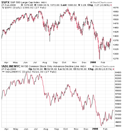
The first indicator is the NYSE Advance-Decline Line, which is probably the oldest measure of market breadth (how the broad market is doing). It simply adds up the number of stocks up each day, subtracts the number that decline, and then adds that to a running total. The figure isn’t as important as the trend—historically, the A-D Line tops a few months before the market does as the generals (big-cap, popular names) move ahead while the troops (broad market) fall behind.
A classic example was back in 2007, before the global financial crisis. Notice how the A-D Line peaked in early June and was nowhere close to its high in mid-October, even when the S&P 500 hit its bull market peak. This pattern showed up at every major top going back three decades.
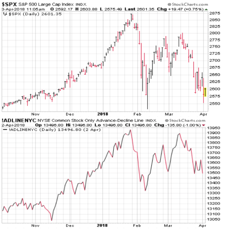
This time around, though, there was no divergence—the S&P 500 and A-D Line topped in unison in late January, rallied back for a few weeks, and are now under pressure. Both are in gear.
Thus, in this case, there was no broad market deterioration before the recent top—something that is seen in well over 90% of major market tops.
Of course, it’s always possible a divergence emerges in the weeks ahead—maybe the S&P and Dow surge back toward their highs but the A-D Line (and anecdotal measures like small-cap indexes) lag. But going with the current evidence, the lack of deterioration prior to the market top tells us this is probably a market correction, not a bear market.
Bear Market Warning Sign #2: Inverted Yield Curve
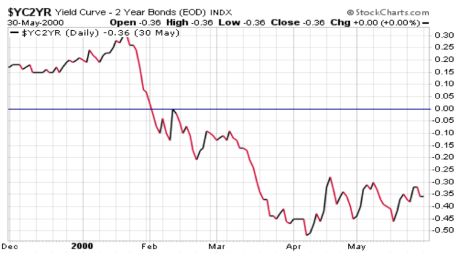
If you’ve been reading me for a while, you know I’m not an economist and focus 99% of my time on the market and leading stocks. But, interestingly, there is one non-market indicator that has flashed before every major top. It’s the yield curve, or the difference in yield between the long-term 10-year Treasury note, and the shorter-term two-year Treasury note.
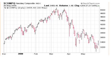
Going back to 1990, the yield curve has “inverted”—meaning the two-year note actually yields more than the 10-year note—four times: March 1990, June 1998, February 2000 and February 2006. The first three times, bear markets began within three or four months. The last time it occurred was obviously early, but preceded the financial meltdown in 2007 and the 18-month stock market collapse. (Shown below is the 2000 occurrence.)
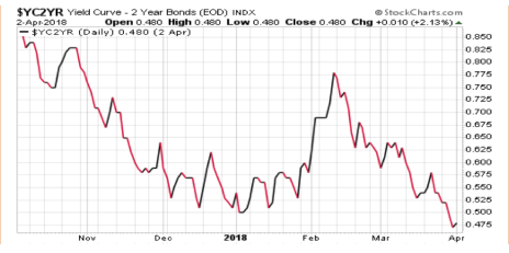
In recent months, while the yield curve has flattened, it hasn’t come close to inverting. (The numbers on the right equal the difference in yields—so right now, the 10-year is yielding 0.48% more than the two-year.)
But What if You’re Wrong?
Great question! I am not someone who tells the market what it should or shouldn’t do, so I’m always open to being wrong. And in this case, sure, there’s a chance a bear market has begun—maybe the unusual nature of the past decade (0% interest rates, quantitative easings, etc.) mean traditional measures like the A-D Line and Yield Curve won’t work.
But, if you use a trend-following approach, the good news is that you don’t have to predict. As I mentioned above, I’ve been advising subscribers to raise cash in recent weeks by cutting losses, booking partial profits and selling stocks that break support. The result: Cabot Growth Investor subscribers are nearly half in cash and still in the black for the year.
Said another way, just because I don’t think it’s a bear market doesn’t mean I’m standing pat. Far from it! With the intermediate-term trend down and many stocks acting toppy, now is a time for caution as we wait for the sellers to finish their work.
If Not A Bear, Then What Is It?
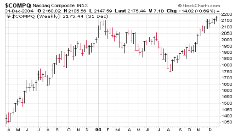
I’m not really into labels, but one scenario we’ve seen play out a couple of times since 2000 is a choppy-to-down, multi-month market correction after a big up year. Look at 2004, for example—after the monster recovery in 2003, the Nasdaq had a big 18% correction from mid-January through early August, after which it embarked on another run (which, by the way, was when Apple (AAPL) initially took off).
A similar situation played out in 2010, again after the monster recovery of 2009—the Nasdaq fell 18% from April through June, and was still stuck in the mud in mid-August.
That’s not a prediction, by the way. But we’re already more than two months into this correction, and another month or two of cooling off wouldn’t shock me. We’ll see what comes.
What’s Looking Like Leadership of the Next Upturn?
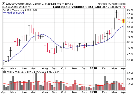
It’s a bit too soon to tell, because at the moment a bunch of stocks have either just begun to correct after big runs (like most of the well-known growth stocks) or have yet to get off their knees. However, one name I continue to think you should keep an eye on is Zillow (Z), which owns the leading collection of real estate websites (including Trulia, Naked Apartments, HotPads, StreetEasy and its own namesake site) that attracted 151 million unique visitors per month in the fourth quarter.
Real estate agents are the main source of revenue, as they shift more of their advertising dollars from offline to online. Revenue growth remains strong in the mid-20% range, while cash flow is growing similarly and earnings are expected to gain 62% this year and much more down the road.
There is some risk that, should the housing market slow down because of rising mortgage rates, Zillow’s growth could slow. But big investors don’t appear worried about that—not only did Z decisively break out in February on excellent volume (five of six weeks came on above-average volume), but it has pulled back toward the top of its base and its 10-week line on lower volume, all normal action.
I’m not opposed to nibbling some here, but I’m simply waiting patiently—Z is near the top of my own Watch List for when the bulls retake control of the market. Assuming it’s not a bear market.
For further updates on the stock market and stocks to buy in this environment, consider taking a subscription to Cabot Growth Investor or Cabot Top Ten Trader.
[author_ad]
