Chart School: Interpreting the Market’s Recent Bounce
In my last Cabot Wealth Daily, I wrote about the likelihood that the market had hit (or would soon hit) a peak of downside momentum. And indeed, ever since Christmas, the market has put on a nice show, which increases my thought that the point of greatest selling pressure has passed, though a bottom-building process in the stock charts could easily take many weeks or longer from here.
Naturally, a ton of stocks and sectors have rallied, too, and that’s led to a slew of questions from subscribers about this, that or the other stock. Interestingly, I noticed that many stock charts right now can be put into a handful of buckets—each with the same meaning and interpretation.
Thus, I thought it was a good time for a little Chart School, using real-time stock charts from the current environment. Just as a disclaimer: most of the stocks I mention below are reporting earnings within the next two to four weeks, so obviously their picture could change. But I can still glean what the odds favor with many names via the recent action. Let’s get started.
[text_ad]
Stock Chart #1: Worst is Probably Over, But No Uptrend Yet
The first category is probably the largest right now—it includes the major indexes and most stocks. It seems like a workable low is in, but the odds of a straight-up advance from here are very small, with plenty of backing-and-filling likely.
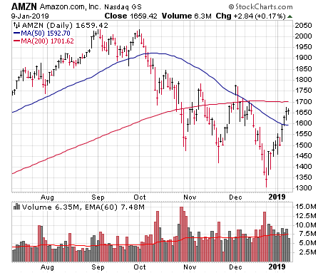
I see two kinds of stock charts in this category, including one that looks like the overall market. Take a gander at Amazon (AMZN), for instance—it got nailed in October and thrashed around for much of November before diving to new lows (briefly) in December. But the two-week rally since Christmas has recouped a big chunk of that December low, come on above-average trading volume and makes the dip below support at 1,400 look like a shakeout. Will Amazon stock revisit its lows? It could certainly happen, but the fact that it’s back to where it was in late October increases the chances the worst has passed.
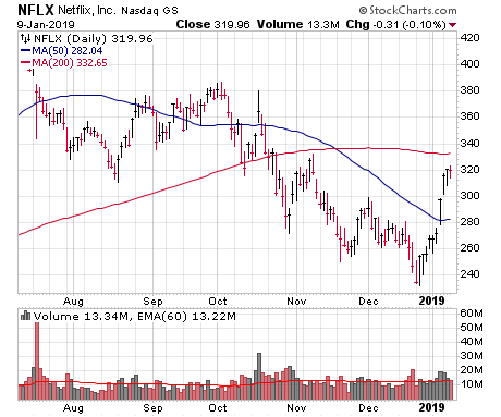
Other examples in this category are stocks that may not have been as overall resilient in recent weeks, but have shown what could be a change in character—stocks that are flashing some sudden power or persistency. One example would be Netflix (NFLX). Like AMZN, it’s back above its October lows, but notice how it’s rallied nine days in a row since the Christmas low, with most on big volume. The stock has also lived above its 50-day line for a few days for the first time since September. Both are technical signs that the supply/demand balance has changed for the better.
Stock Chart #2: Defensive Play, Run Looks Over
For October, November and even some of December, I saw many defensive-oriented stocks (safe havens) run higher. A lot of beginning investors get tricked into plowing into these names since their trends are up, but usually it’s a bit of fool’s gold; eventually, these names get hit during the market downturn, and then they underperform after the indexes improve.
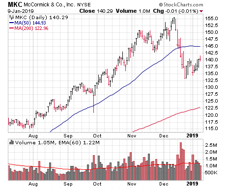
McCormick (MKC) is a good example. Yes, it was trending higher in July, August and September, but the stock continued to motor ahead (and even accelerated its uptrend) after the overall market topped out. But then MKC suffered five straight days of giant-volume selling (which in itself is a sell rule) and has barely bounced since the low. Big picture, I’d be avoiding some defensive plays that may seem cheap here; if the market shapes up, there will likely be better names to own.
Stock Chart #3: Back Burner Watch List
These are stocks that held up relatively well during the decline (though not as well as the cream of the crop) and have bounced decently since. The idea is that they could emerge in a few weeks, but still need time to properly set up—I’m watching them, but they’re on the back burner for now.
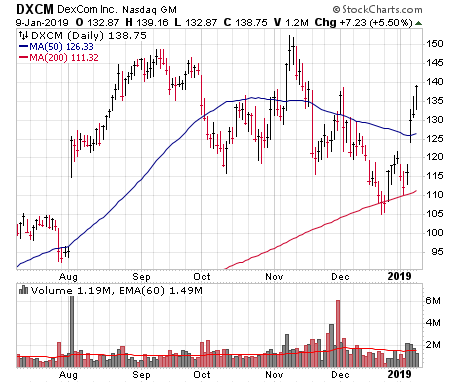
Dexcom (DXCM), maker of the G6 continuous glucose monitor, fits in this category. Sure, the stock took some hits (down about 31% from high to low), but it held its 200-day line during the December crash, which was better than 90% of stocks out there. And now (thanks to a solid 2019 outlook at a conference this week), the stock has popped on good (not amazing) volume.
That said, while it’s looking solid, the stock has a good amount of overhead to chew through in the 140 to 150 area. Not saying I would definitely wait for shares to hit new highs to buy it, but DXCM is likely going to need a little while to rally further, pull back, tighten up, etc., before it completes its launching pad.
Stock Chart #4: Front Burner Watch List
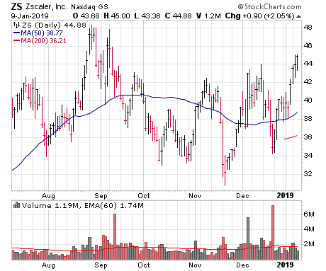
These are stocks that, simply put, I like, and am waiting for an entry point. I’ve written about many of these in my last few columns and, of course, in my Cabot Growth Investor and Cabot Top Ten Trader advisories. There are (happily) many examples, but one is Zscaler (ZS), which held up pretty well after its September-October dip, etched a higher low in December and is now stretching toward its old highs. I’d like a lower-risk entry point, but this is one among many that I’m keeping a close eye on.
Stock Chart #5: Watch List, Already Broken Out
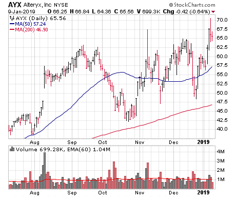
These are names that held up well, and (mostly) didn’t even take the time to set up, but have already pushed out to (or very close to) new highs on solid volume. Take a look at Alteryx (AYX), a leader in the newer advanced analytics software industry (I think of the group as a follow-on to the initial Big Data movement). Shares got hit numerous times during the market’s slump, but etched higher lows all the while, snapped back quickly after every dip, and this week, briefly spiked to new highs as the market rallied.
As a heads up, breakouts are low-odds plays in downtrending markets. Thus, I’m not saying a stock like AYX has a huge chance of a straight-up move right now. (Indeed, AYX has pulled back since the breakout attempt.) But obviously these are the names that are in pole position if this market rally turns into the real McCoy.
So what’s the point of all these categories? Simply that sorting some names (mostly the ones I’m watching) into buckets helps me when it comes to prioritizing certain names and setting expectations, too. If a bunch of names that look like they’ve probably bottomed go on to implode, for instance, it would tell me the selling pressures are spreading, whereas if a bunch of back burner watch list stocks breakout within a week or two, things are even stronger than they appear.
[author_ad]

